
Assemblage – A Gathering Of Wine & Friends
Brand Identity Creation / Packaging Design / Business Cards & Collateral
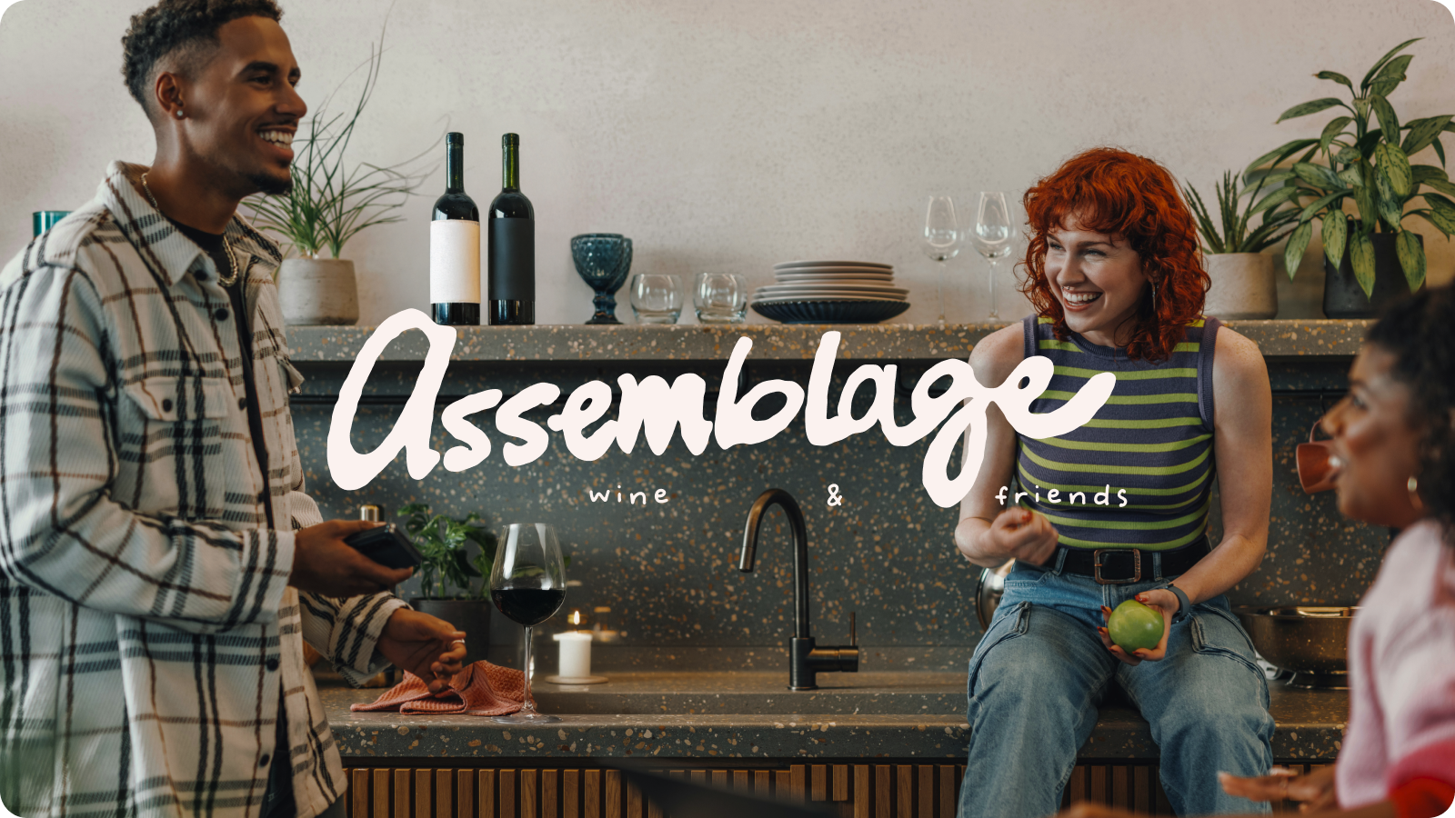
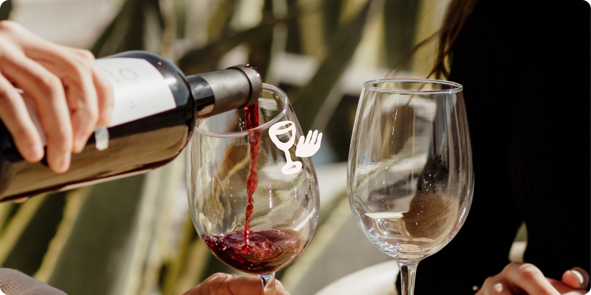
Assemblage was built around one simple idea: wine is better when it’s shared. The name itself speaks to a collection or gathering, becoming the natural foundation for the identity.
Rather than leaning into the traditional world of wine, Assemblage invites people to make it their own. Bring ideas together to create something new. We developed a playful, approachable brand identity that brings the social and creative side of wine to life. The result is a brand that feels expressive, welcoming, and a little unexpected – just like the experience itself.
Credits
Jade catunao
Michelle Le
Jordynn Teders
Sebastian Guenther
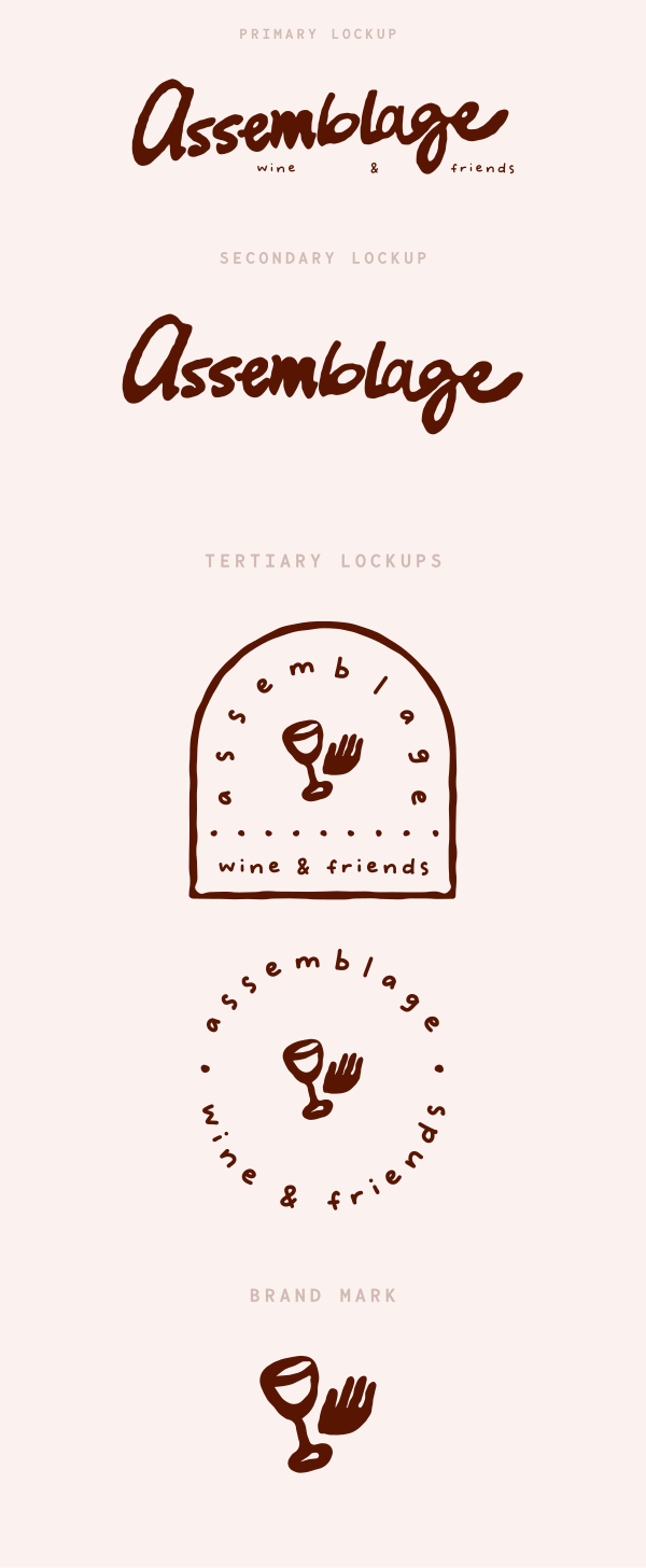
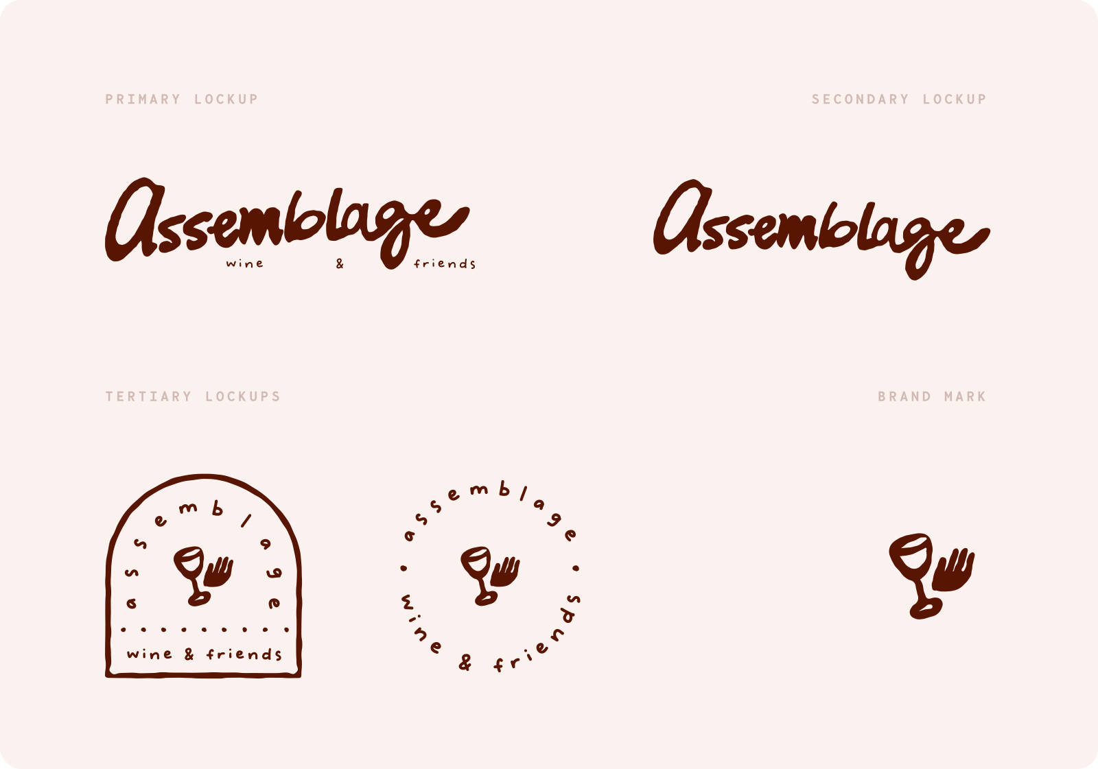
The Logo & Branding
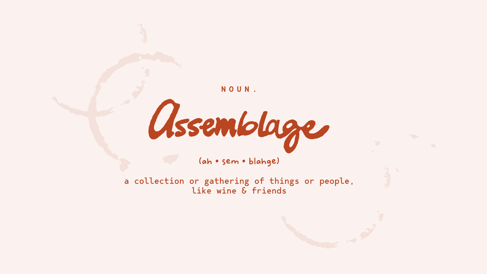
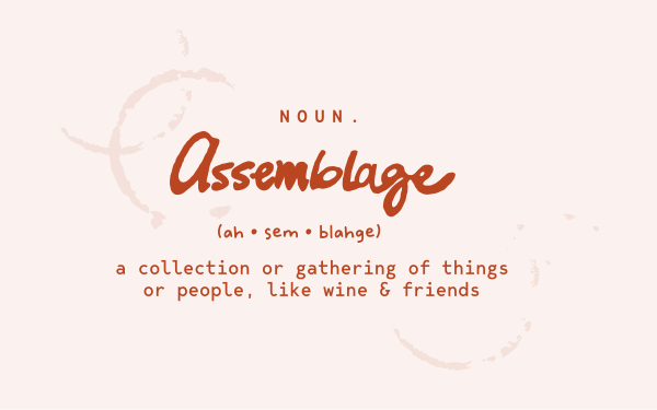
Wine can feel pretty polished. Assemblage didn't need to be.
We hand-drew the logo to bring a little more humanity into the identity, embracing the natural imperfections and personality that come with something made by hand. The loose, expressive lettering and elements gives the brand a sense of warmth and approachability, while reinforcing the idea that Assemblage is about bringing different things together to create something new.
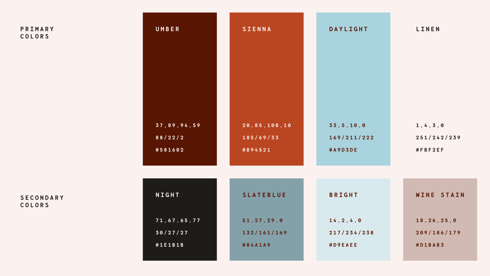
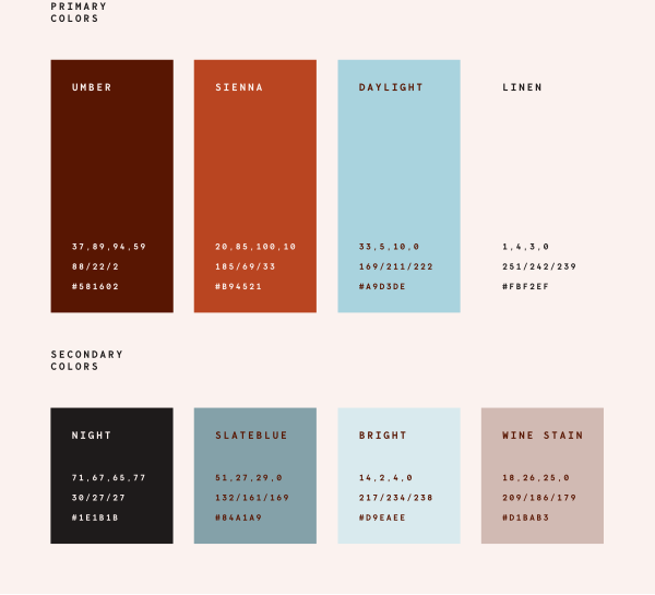
Brand Application
For Assemblage, the brand needed to become part of the experience.
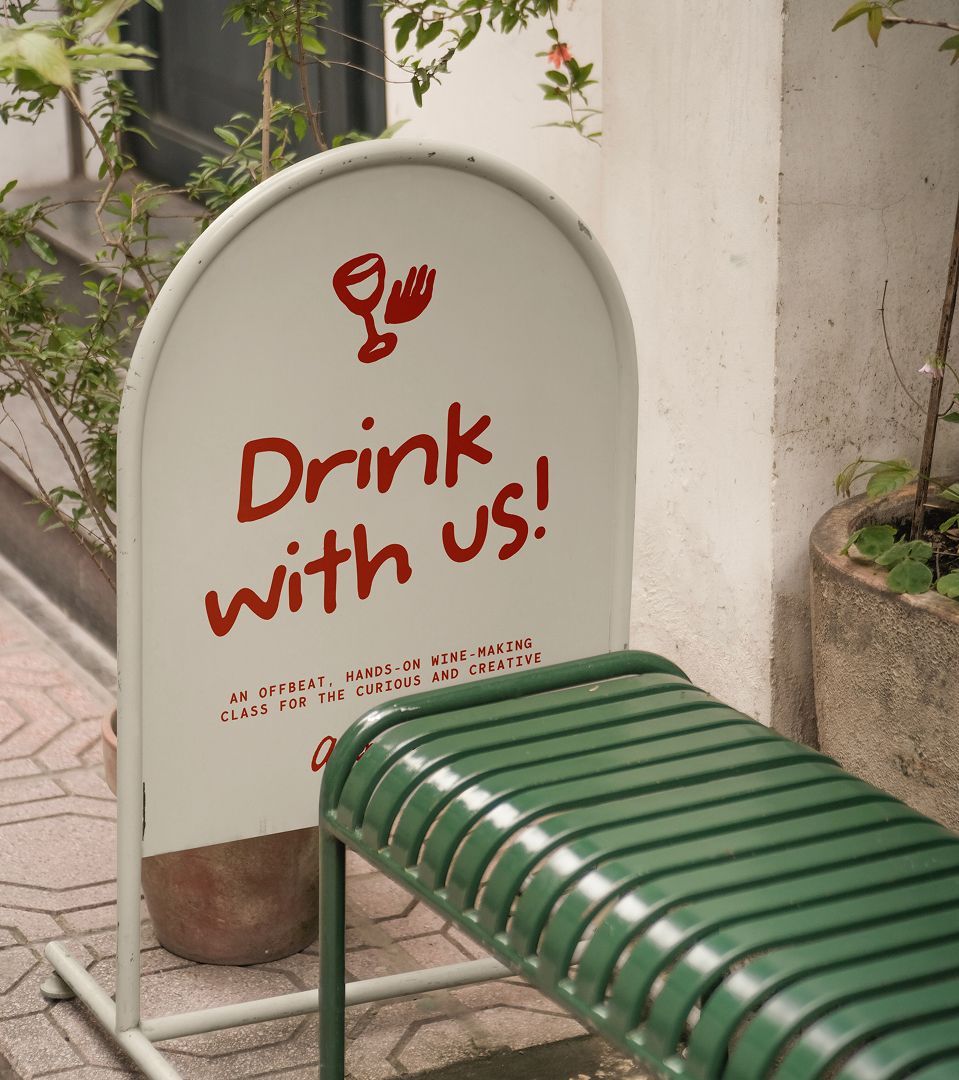
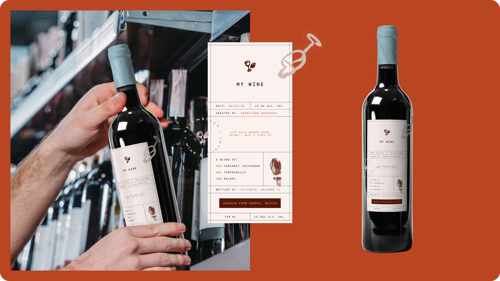
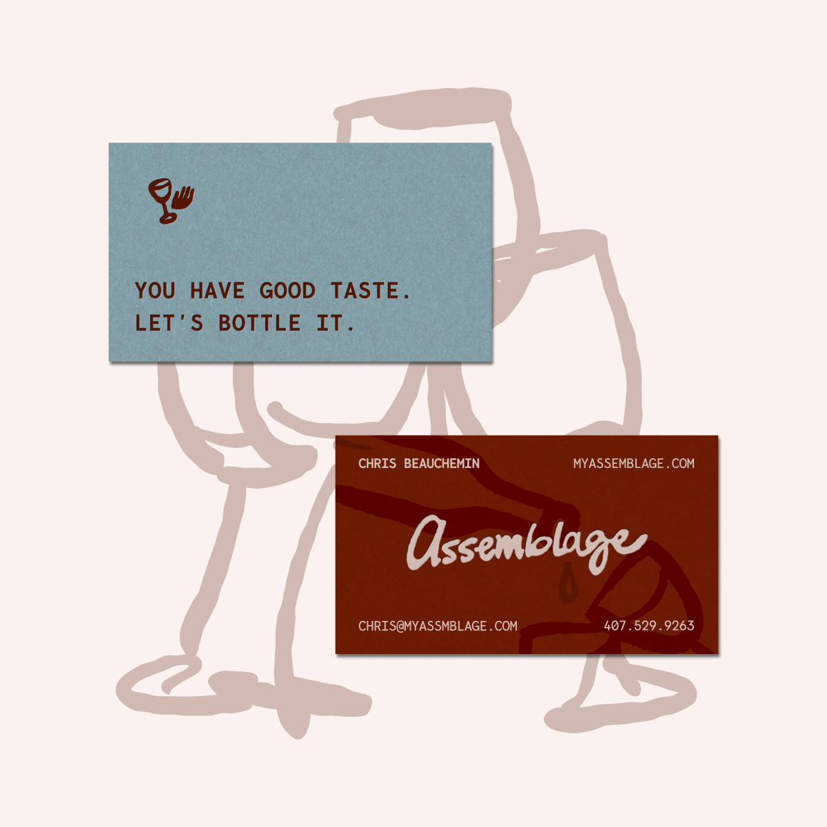
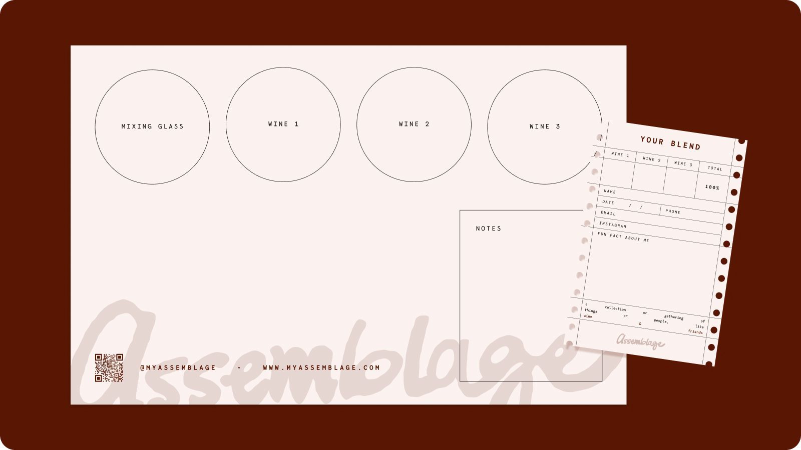
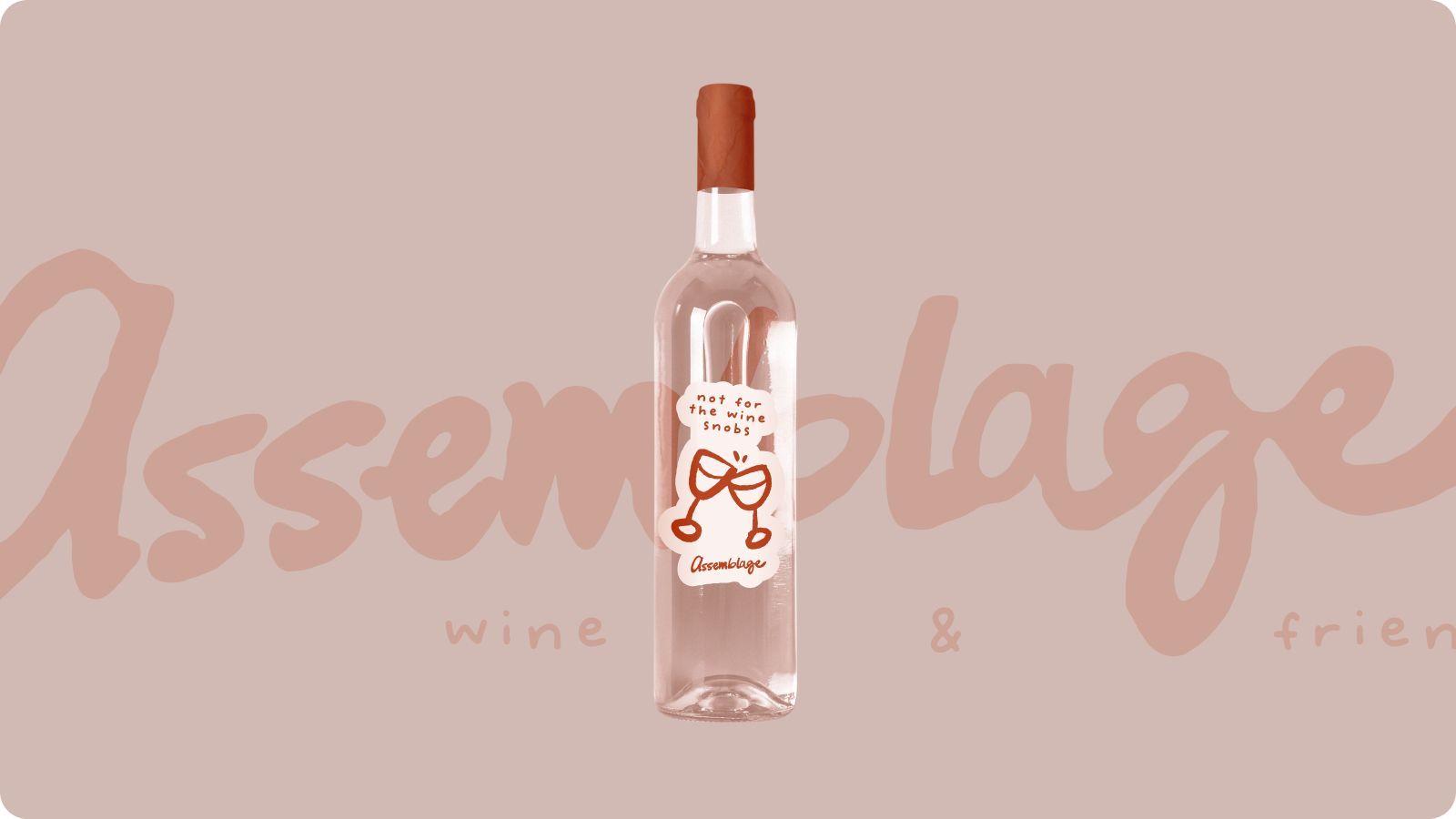
We carried the identity across custom wine labels, blending materials, business cards, and other touch points to create a cohesive system that feels just as personal as the wine itself. The bottle labels give each blend a sense of ownership, while the supporting collateral turns the process of tasting, mixing, and creating into something people can interact with.
Every detail reinforces the same idea:
this is your wine, your blend, your story.
See More Cool Stuff
Everyday Play – Designing for Playful Living
Tonester – Where Color Meets Luxury
Ready to work together?